This is a complete guide on writing an alt text in different scenarios and contexts.
How to Write a Good Alt Text?

Alt text should be a short but specific description of what happens in the image.
In an ideal world, the alt text delivers the same value to those listening to the post as those reading it.
To write a good alt text, imagine yourself describing the image over a phone to someone with as few words as possible.
I think the best way to learn how to write good alt texts is by taking a look at some good examples.
By the way, feel free to watch a video version of this post:
Example1
Context
The following image is in a blog post about the best beaches in the UK. In the image, there’s a woman looking at the sunset on the beach.

Bad Alt Text:
“Sunset beach image”
The alt text above is too vague. It does not convey any meaningful information about the image.
It simply states that it is a picture of a beach without describing the details, leaving no context about the content of the image.
This can be frustrating and does not contribute to a positive user experience.
Good Alt Text:
“A woman enjoying a beautiful sunset on a beach in North Berwick, UK.”
This alt text provides a concise yet informative description of the image, conveying the key elements and setting of the scene.
Let’s take a look at another similar example before moving to those trickier ones.
Example 2
Context
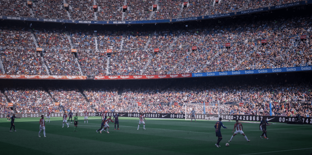
The following picture is in a blog post that recaps FC Barcelona’s season 2018-2019.
Bad Alt Text:
“Soccer game in a full stadium”
This description isn’t helpful at all. It leaves the reader with a very vague understanding of what’s happening.
In this context, many readers are Barcelona fans or follow soccer closely. They might find it insightful to know the game that’s in question in the image.
Good Alt Text:
“Spectator view of FC Barcelona playing against Atletico Madrid in Camp Nou in 2018”
Much better!
But it’s not always this easy. Let’s repeat this example image in a different context.
Example 3
Context
Let’s insert the image from the previous example into a different context.
This time, the image is in a blog post about the health benefits of sports.

Bad Alt Text:
“Spectator view of FC Barcelona playing against Atletico Madrid in Camp Nou in 2018”
In this context, this alt text gives too many details. Even though this would’ve been a perfect alt text for the previous example.
Here, most readers don’t know about FC Barcelona, Atletico Madrid, or Camp Nou. And even if they did, it brings no additional value.
The people who see the image don’t care. So shouldn’t the ones that cannot see it.
Good Alt Text:
“Soccer game in a full stadium”
Because it’s an article that talks about sports, not soccer, a high-level alt text is better!
Example 4
Context
A product review of Adobe Photoshop vs Affinity Designer in the section “Which one should I choose”.

Bad Alt Text:
“Road sign in the middle of a desert pointing in both directions”
In this context, the image is just a decoration that breaks up the text. It doesn’t provide any additional value to the readers of the review. Thus, an alt text can only confuse the listeners of the post.
Good Alt Text:
“”
Yes, that’s an empty alt text. It’s not a mistake.
If the image doesn’t provide additional value to the reader, don’t specify the alt text. This way you save the screen readers’ time and don’t confuse them with irrelevant alt texts that don’t support the content.
How to Set Alt Text in WordPress?
But how do you specify the alt text?
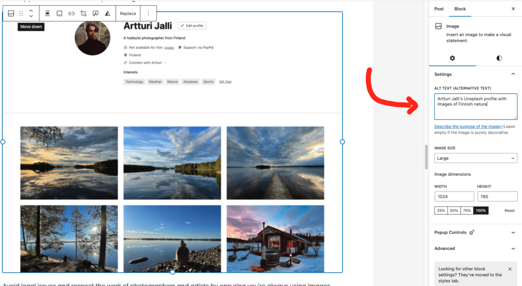
If you’re running a WordPress site, setting the alt text is easy:
- Open up a blog post.
- Click “Edit”.
- Click on an image.
- Choose the “Block” section on the right-hand side settings tab.
- Scroll down to Alt text.
- Specify the alt text.
Here’s an image that illustrates the process:
Alt Text vs Image Description
It’s easy to confuse alt text with the caption or the description of an image.
But those two are entirely different things!
Alt text: A written description of an image for people who can’t see it. This is a must in every blog post to make it accessible for everyone.
For example, “A dog catching a frisbee in a sunny park”.
Caption: An explanation that directly accompanies an image. It usually adds information about what’s happening in the image. A caption is not necessary for every image.
For example, “Buddy, the golden retriever, enjoys his day in Central Park.”
So the alt text describes the image for accessibility purposes, while a caption provides context.
Geek Alert: Alt Text Behind the Scenes
Let’s take a behind-the-scenes look at the alt text.
If you’re interested in HTML or are coding your website from scratch, it’s especially useful to know how it works.
The alt text is nothing but an extra alt attribute in the HTML code behind the scenes.
This attribute, nestled within the img tag, is the actual way how websites specify the alt text to images.
So if you’re displaying an image of a sunset over the ocean, your HTML could look like this:
<img src="sunset.jpg" alt="Sunset over the Pacific Ocean">For example, here I’m using the HTML/JS inspector to check the alt text of one of my blog post images.
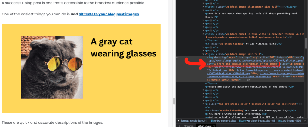
There you have it – the understated power of the alt attribute in HTML!
Thanks for reading. Happy writing!
